The Nordic Palette: Colors That Define Scandinavian Spaces
When you think of Scandinavian design, clean lines, minimalism, and functionality may come to mind. However, one aspect that often gets overlooked is the importance of colors in creating the iconic Nordic aesthetic. Scandinavian spaces are known for their light and airy feel, often achieved through the use of a specific color palette. In this article, we will explore the colors that define Scandinavian spaces and how they contribute to the overall design aesthetic.
The Influence of Nature

Scandinavia is known for its breathtaking natural landscapes, from snow-capped mountains to serene fjords. It comes as no surprise that nature has a significant influence on the color palette used in Scandinavian design. The colors found in Nordic spaces often reflect the hues of the surrounding environment.
The Nordic color palette is characterized by muted tones inspired by nature, such as soft blues, cool grays, and warm earthy tones. These colors create a sense of calmness and tranquility, allowing the mind to relax and unwind. They also serve as a backdrop for natural materials like wood and stone, which are commonly used in Scandinavian interiors.
White: The Dominant Color

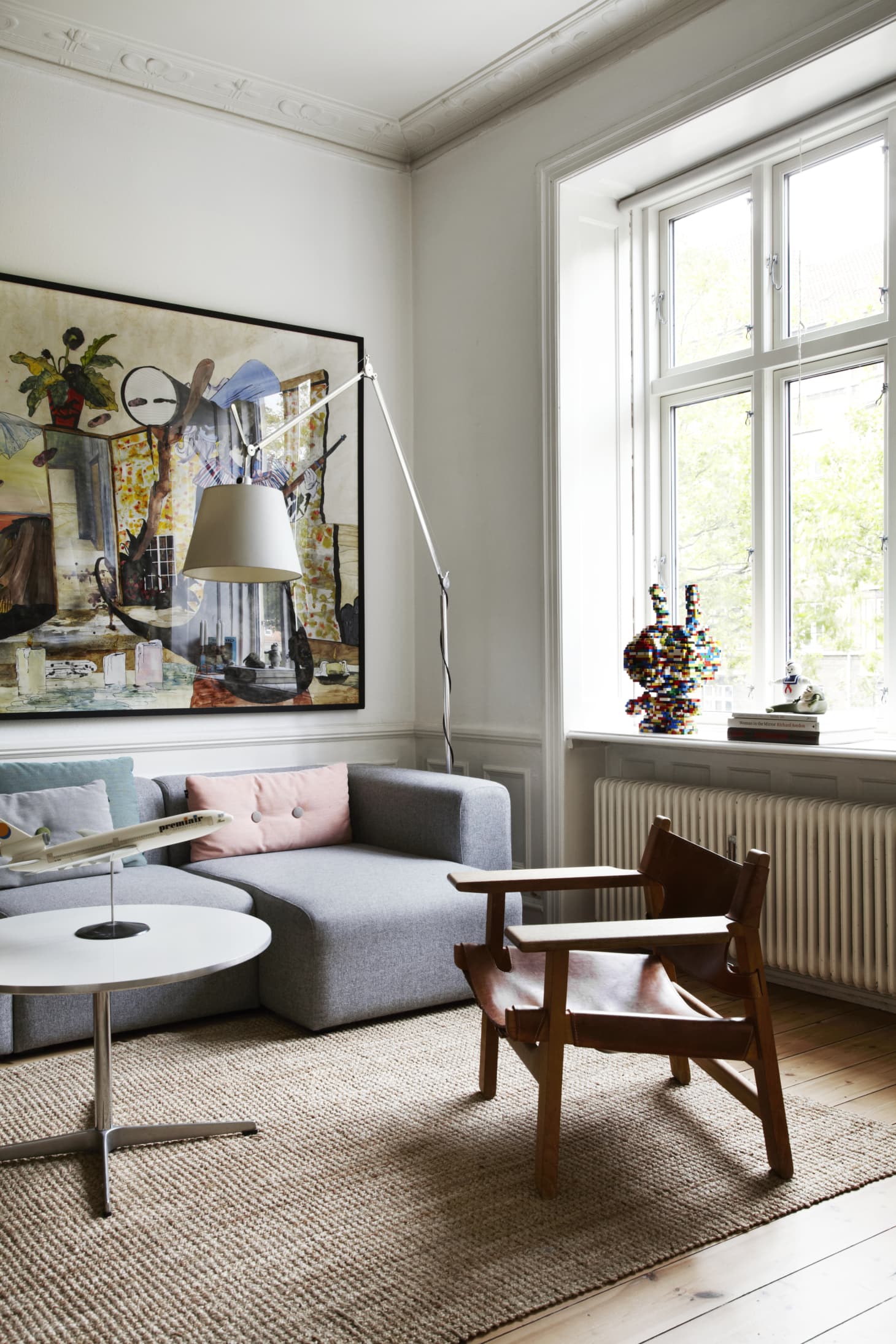
White is undoubtedly the dominant color in Scandinavian design. It is used as the base color for walls, ceilings, and floors, creating a blank canvas that allows other elements to stand out. White also reflects light, making spaces appear brighter and more spacious, which is particularly important in the long, dark winters of the Nordic region.
In addition to its practical benefits, white enhances the minimalist aesthetic of Scandinavian design. It creates a sense of purity and simplicity, aligning with the overall philosophy of less is more. The use of white also allows for easy integration of colorful accents and accessories, adding pops of color to the otherwise neutral spaces.
Soft Blues and Cool Grays

Soft blues and cool grays are commonly used in Scandinavian interiors to add depth and create a sense of serenity. These colors are reminiscent of the Scandinavian sky and sea, further emphasizing the connection to nature.
Soft blues can be found in textiles, such as curtains, rugs, and cushions. They add a touch of color without overpowering the space. Cool grays, on the other hand, are often used for furniture and larger surfaces, providing a neutral backdrop for other elements in the room.
Earthy Tones

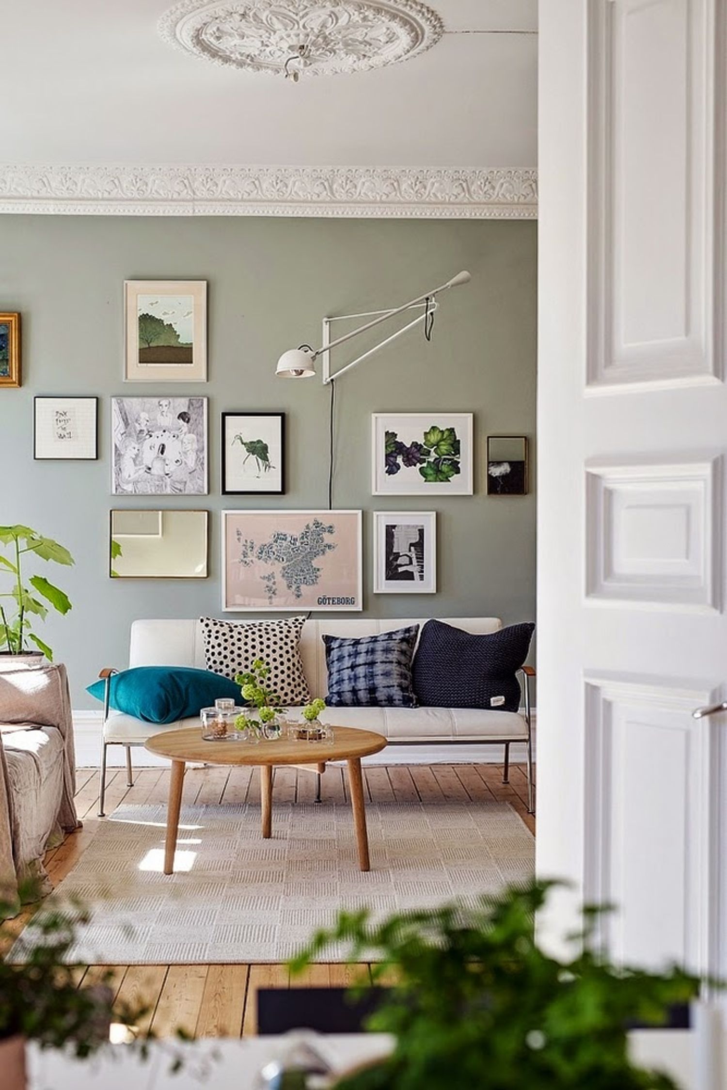
Earthy tones, such as warm browns and muted greens, are also commonly found in Scandinavian design. These colors bring a sense of warmth and coziness to the space, creating a welcoming atmosphere.
Warm browns can be seen in wooden furniture and flooring, adding a natural element to the room. Muted greens, inspired by the Nordic forests, are often used in textiles and accessories, providing a subtle pop of color.
Contrasting Accents

While the Nordic color palette is predominantly neutral, contrasting accents are used to add visual interest and create focal points in the room. These accents are often found in the form of bold, vibrant colors.
Red is a popular choice for adding a splash of color to Scandinavian spaces. It can be used in furniture, artwork, or even small decorative items. Yellow is another accent color that brings warmth and energy to the room. These contrasting accents create a sense of balance and prevent the space from feeling too monotonous.
The Importance of Light

Light plays a crucial role in Scandinavian design, and the color palette is chosen to maximize the effects of natural light. The long, dark winters in the Nordic region make it essential to make the most of the available daylight.
By using light, neutral colors, Scandinavian interiors reflect more light, making the space appear brighter and more spacious. This effect is further enhanced by the use of reflective surfaces, such as mirrors and glossy finishes. These design choices help to combat the darkness of winter and create a sense of openness and airiness.
Summary

The colors that define Scandinavian spaces are carefully chosen to create a sense of calmness, simplicity, and connection to nature. White serves as the dominant color, reflecting light and providing a minimalist backdrop for other elements. Soft blues, cool grays, and earthy tones are used to add depth and warmth to the space, while contrasting accents bring visual interest. Ultimately, the Nordic color palette, combined with an emphasis on natural light, contributes to the timeless and inviting aesthetic of Scandinavian design.